Go Ahead, Get Graphic!
5 tips for communicators to tell better stories with numbers
As newspapers battled for readers in the early 20th century, a longtime editor and columnist for William Randolph Hearst described the importance of images.
“If I show you a picture of a pebble half an inch high on a magazine page and ask you how high it is, you cannot tell,” Arthur Brisbane, editor of the New York Evening Journal, said in a speech in Syracuse, N.Y. in 1911.
“But if I put a housefly beside it twice as large as the pebble, you say it is a grain of sand,” he continued. “If I take out the fly and put a man on horseback on top of the pebble you say it is a boulder…. Use a picture. It’s worth a thousand words.”
Four years later, the value of images had dramatically shot up.
“One picture is worth ten thousand words,” Brisbane wrote in a column.
How much more valuable are images now?
Yet it’s a lesson that organizational communicators are challenged to apply. We use stock photos of people in generic work settings rather than feature colleagues that the audience might recognize. Or we publish photos of actual employees with frozen smiles in awkward poses.
A lack of time and a shortage of resources usually explains our lack of attention to the visual presentation of our stories. Those obstacles also limit our attention to the infographics, the visual representation of the information in a story. It’s a shame.
“Adding a visual element will always grab readers—especially when they’re worried, frustrated and working at home, surrounded by pets, partners, spouses, children or parents who’ve morphed from loved ones into irritating distractions, draining away the readers’ dwindling reservoir of focus and concentration,” according to Bob Zeni, Ragan Consulting Group’s design consultant.
Our focus with graphics is whether readers will understand. We leave to experts like Bob to tell us how it can be done.
The Wall Street Journal generally does a great job of incorporating graphics into business stories, which makes it the logical place to look for examples. We also pluck an example from the New York Times. Sitting at the breakfast table, we have the luxury of time to second guess and nitpick. Here are our five tips on making better graphics.
1. Go graphical early. Before writers start reporting, we recommend they write a story pitch or story memo, which should include a first draft of the headline and first sentence, as well as graphic and photo ideas.
Graphic ideas might come more naturally when writing a data-driven story. But a graphic helps readers with any story that has numbers. Consider:
Big Four Audit Shortfalls Stabilize, Latest Inspections Show
The firms’ U.S. units collectively had a deficiency rate of 26%, the same as a year earlier, with the PCAOB chair calling the overall results still unacceptable
Wall Street Journal
Aug. 15, 2024
PricewaterhouseCoopers and Deloitte experienced greater deficiencies in their audits of public companies’ 2022 financial statements compared with the previous year, while the overall rate of Big Four accounting firms’ shortcomings stabilized, according to the latest annual inspection reports….
Deloitte and PwC’s U.S. units had rates of 21% and 18%, respectively, both up from 17% and 9% a year earlier. EY continued to have the highest deficiency rate among the Big Four in the U.S., at 37%, down from 46% the year prior, which marked a surge from 21% the year before that. KPMG’s rate fell to 26% from 30%.
That’s a mouthful of numbers. Complementing the story with a bar graph of a year-to-year comparison would have been more eye-catching than the image the Journal used: a file photo of a skyscraper bearing KMPG’s name. (Why KPMG?)
2. One thing. “Every story should be about one thing,” we’ve written. “It will have other things in it, but it’s about one thing.”
Here’s a corollary: Every graphic should be about one thing, like this story:
Inflation Extends Cooling Streak to Hit 2.5% in August
Price increases eased to new three-year lows, teeing up the Fed to begin gradually reducing rates next week
Wall Street Journal
Sept. 11, 2024
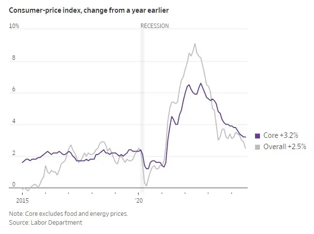
There are eight major components to the Consumer Price Index, but the graphic compares the total with just one, the core figure, which excludes volatile food and energy costs. Going back to 2015 gives context to the Federal Reserve’s effort to slow the pace of price increases.
Our preference is to include a brief sentence under the headline introducing the image, without duplicating the headline or teaser (the sentence below the hed.) That sometimes isn’t the Journal’s style.
For this graphic we’d suggest: The overall rate of inflation fell for the fifth straight month in July, to 2.5%.
3. Start at the beginning. John Bennet, a longtime editor for The New Yorker, used to say, “Chronology is your friend.” That’s true of graphics. Consider this graphic:
What’s Wrong with Starbucks?
Prices are up—and so are the wait times. But that’s just the tip of the iced-latte-berg. The coffee giant’s new CEO will have his work cut out for him.
Wall Street Journal
Aug. 16, 2024
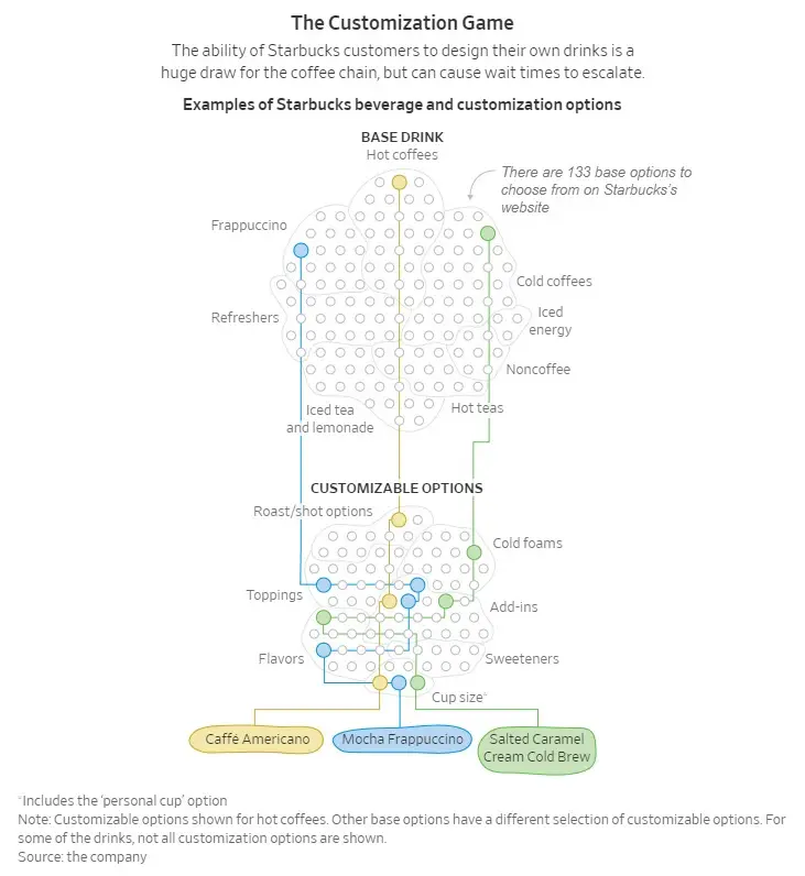
The purpose of this graphic is to show how complicated an order can be. It succeeds, although in a Rube Goldberg-style fashion. Unfortunately, it lacks the cartoonist’s sense of irony.
Where the graphic falls short is the placement of the names of the orders at the bottom of the graphic. Those labels catch readers’ attention.
But the process starts with the customer’s order, such as the Salted Caramel Cream Cold Brew. (Whew!) The labels would have been better placed at the top.
(Not sure what the cell structure is meant to convey. We’ll call that artistic license.)
4. What’s the point? Line graphs and bar charts should start at zero. Everyone understands what zero means. Consider this graphic:
Elon Musk’s Twitter Takeover Is Now the Worst Buyout for Banks Since the Financial Crisis
Loans of around $13 billion have remained ‘hung’ for nearly two years, bringing in interest payments but weighing on banks’ balance sheets
Wall Street Journal
Aug. 20, 2024
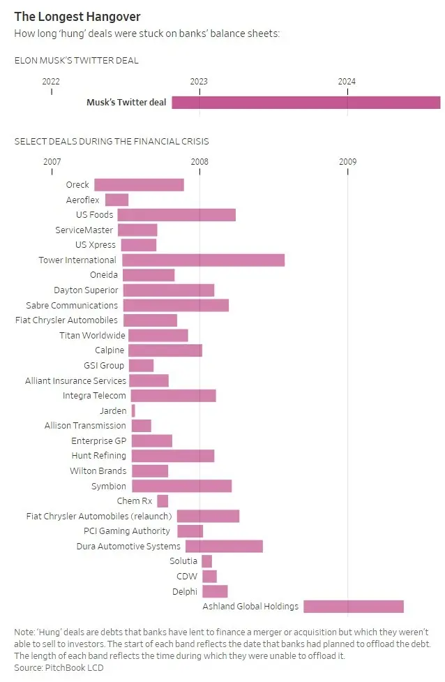
This graphic is complicated by two different time frames: the Twitter buyout, 2022-24, and the financial crisis. This graphic required someone to ask: What are we measuring? The answer: The number of months the banks held these loans on their balance sheets.
The story could have used a clear statement of that comparison, like: The banks who lent Musk $13 billion to buy Twitter in October 2022 have been unable to sell the debt to other investors for 22 months, 10 months longer than the worst deals of the 2008-09 financial crisis. That’s what we’re comparing: 22 months versus 12.
If we make that decision, then we would ignore the calendar and start every bar at zero months, including Musk’s Twitter purchase. We’d include the year with the name of the transaction.
5. Check? Check! Proofread the data before it goes to a graphic artist and again when you see a draft and every time somebody tinkers with it. Consider this graphic published in the Times’ Business Day section:
Approach Boss with Caution
The New York Times
Jan. 19, 2007
On a scale of one to 10, with 10 being the most volatile personality, Jonathan G. Ornstein, chief executive of the Mesa Air Group, cheerfully admitted, “I used to be an 11.”
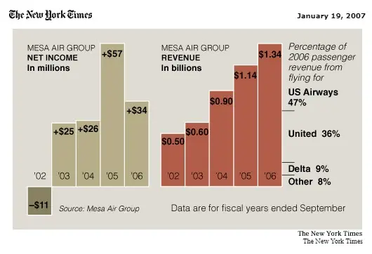
Accompanying the story was a graphic about the net income and revenue for the regional carrier, which transported passengers for other airlines. It looks great but wasn’t always that way.
The day after the story was published, the Times issued a correction: “A chart in Business Day yesterday with an article about the chief executive of the Mesa Air Group referred incorrectly to the company’s revenue for the years 2002 through 2006. It was in billions, not millions. A corrected graphic can be found at nytimes.com/business.”
No, it wasn’t Confucius who talked about the value of a picture. Brisbane emphasized pictures because the Evening Journal’s readers “did not have the time, background, or inclination to wade through the longer, detailed, more literary articles,” according to a Hearst biography.
Sounds like the audiences we have today.
Tom Corfman is a senior consultant with Ragan Consulting Group who thinks writers, photographers and graphic artists should work together like line cooks.
Contact our client team to learn more about how we can help you with your communications. Follow RCG on LinkedIn and subscribe to our weekly newsletter here.

